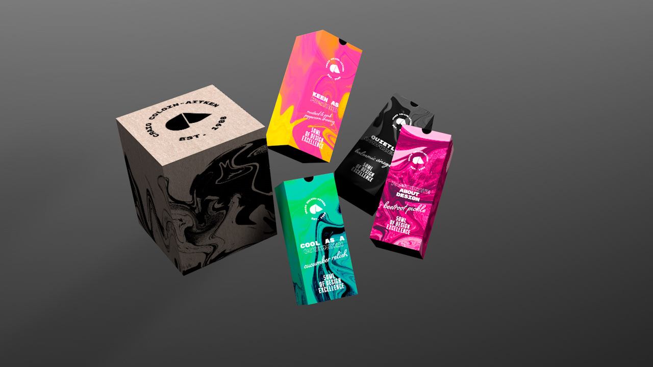
This self promotional package was made in response to a self-initiated brief for my final year of University.
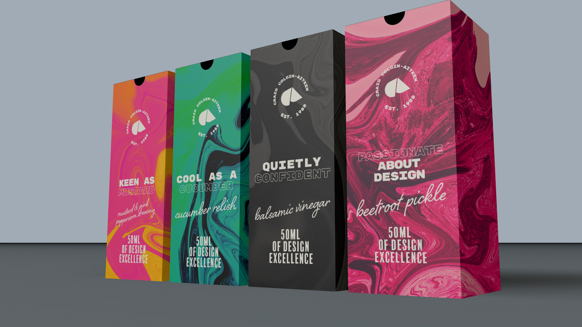
The idea was to create a package which communicated who I am as a designer. Most of my existing experience is in food, so I wanted something that told any prospective employers about this. I also like bold colour choices and strong typography. and I think these outcomes communicate this well.
The smaller boxes would sit inside the larger cardboard box - this would be sturdy enough to send in the mail.
The colourful 'ink swirl' images were created by using the liquify tool in photoshop on some of my own photographs, taken when on holiday or of specific moments in my life that I like to look back on. This adds a personal element to the packaging, but isn't obvious, which avoids any emotional connotations.
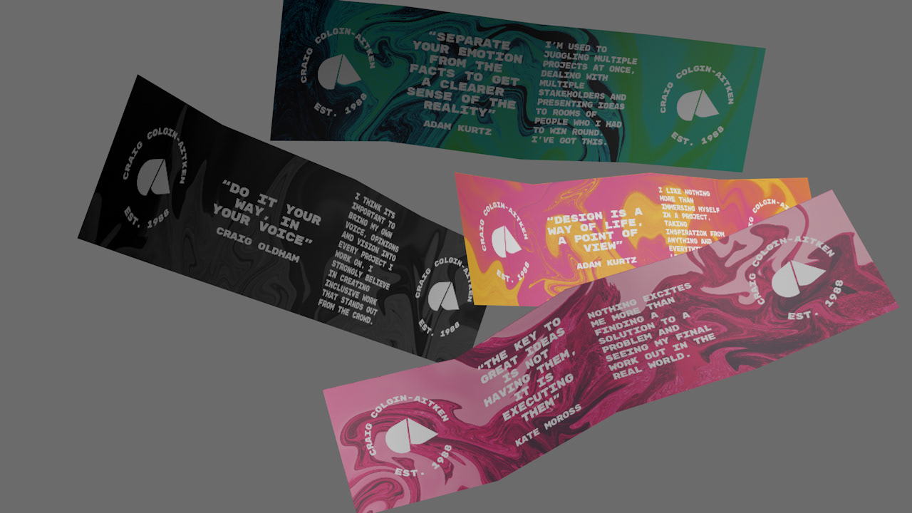
Each small box contains a 'hot sauce' bottle and an insert featuring inspirational quotes from contemporary graphic designers and how I interpret their words in my own work. These are pictured in the images below.
The inserts would be folded up and sit on top of the bottles in the small boxes, meaning they are the first thing seen before the bottle is taken out, giving some context to the contents.